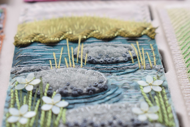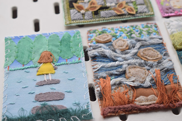
Oh golly gosh, I really like these cards! There's so much wonderful variety and texture, and perspective, in them. It's interesting to me at the moment to look through them and try and see it from a design and composition point of view - in a few weeks I'm giving a talk on Colour and Design, two incredibly broad subjects to be crammed into a short session, and quite a lot of the design element involves composition, perspective, the vanishing point, the rule of three etc, and you can clearly see these principals reflected in these cards.
The two cards on the right hand side really emphasis the vanishing point, as the lines recede into the distance in a clear triangular shape, as if they are disappearing to an imagined end point on the horizon. I've sort of done the same thing but in a more wiggly way, as has the card in the centre. The perspective here is created by making the shapes smaller and therefore appearing further away in the landscape. The horizon lines are still there but being meandered to rather than walking a direct route.


A few of these cards are appearing to be viewed more from a birds-eye-view, so they don't have a horizon for anything to vanish off into. They are more textural and use other compositional tricks (most of which are usually completely subconscious, I doubt everyone would have been reading into why they have placed certain elements in certain places). The rule of three, or odds, appears several times. Things in threes look more harmonious, natural and visually appealing whilst bigger odd numbers challenge the brain slightly but can create a balance with the central point and even numbers either side of it.
I love these little teeny weeny buttons on this paving piece. the colours here are lovely with the little knots and picot stitches embroidered into the gaps between the slabs, and the cut out fallen leaves just lightly stitched on top! It's really clever.
The little lady in this piece is really evocative too, especially with her yellow dress contrasting beautifully with the blues!! (I've been thinking a lot about this talk, can you tell?)
The stitching on this one is really nice too, lots of little french knots and detached chain stitches to build up texture with the moss or flowers - different sizes of french knot too to create subtle changes in height. I like how the buttons have been stitched down!
The vanishing point perspective is strong with this piece - it's very visually striking, all lines point to the flowers in the centre so your eye can't help but be drawn to it, and then with the pop of the red against green and white it's almost like you are being zoomed into it for a closer look.
At the end of the day though, once you've analysed all sorts of reasons as to why a piece works, all that really matters is that the ladies had fun making and stitching and thinking about their pieces, rummaging through their stashes for that perfect fabric, or searching for inspiration around them. The more you practice and make and do, the more easily you can understand or bend and break the rules and enjoy what you're doing with confidence. There is no right and wrong, and these beautiful cards clearly show that by being themselves.


No comments:
Post a Comment