
Pink Moon is finished!! I was sort of losing my way with this one a bit, which I think is because it took me so long to do that it started to get a laborious edge to it. Not that it was any fault of the Stitchscape - my whole weekly routine has changed and suddenly the time I usually have for embroidery has shrunk significantly!! Thanks to the pandemic, I haven't been using the bus to get to my 'other' job three days a week and have been very privileged to be chauffeured to work, literally door to door in half an hour, there and back. Which is fantastic because it gives me over two hours extra a day to potter around, or sleep later in the morning but for some reason those two hours aren't utilised for stitching. Whilst on the bus in my old routine there would be half an hour waiting around for the bus then an hour to sit and sew each way so embroideries progressed much faster.
As it is I've been using 15 minutes here and there pre-work and at lunchtime, maybe grabbing a couple of hours at the weekend or in the evening so it's been slooooooowwwww. This is a bigger one too, stitched in a 20cm hoop so that's always longer to finish than my usual 15cm hoops.
I'm pleased with how it has turned out though. It's a different colour to my usual themes and this may also be one of the reasons I couldn't get my head around certain aspects. Pushing comfort boundaries is good I think and I've just finished off another piece in a similar colour theme which had the same problem so I'm feeling accomplished!
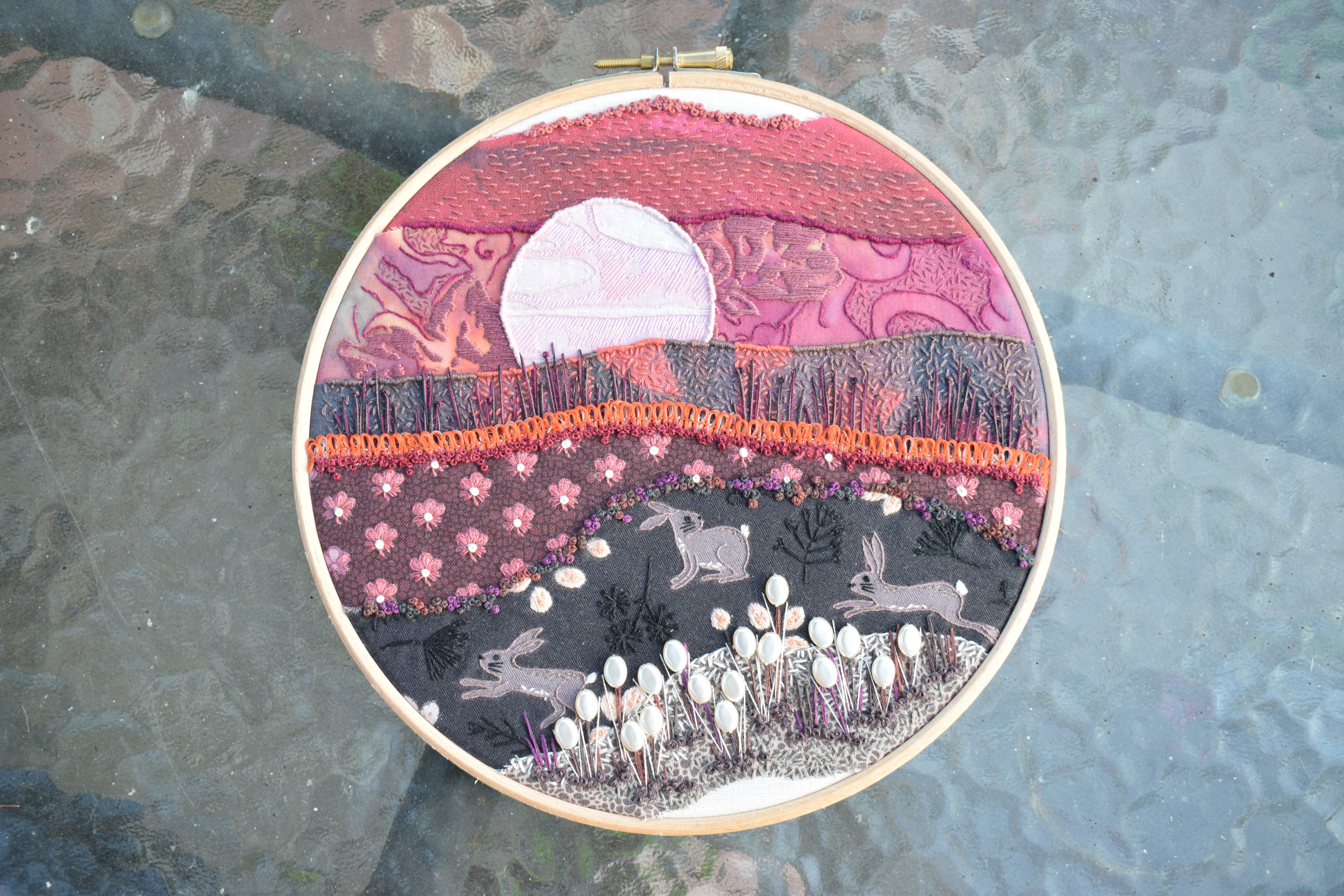
I especially like my moon because of all of the different colours in it. Previous moon-scapes have had the moon as a single white colour, maybe with a touch of shine but this one has at least four shades of pale pink/lilac in it which really makes it stand out. You can almost see the man on the moon waving at you. Hulloo!!
I took some advice from my social media followers as well, after some nifty photo editing on my part. I thought I had finished but something wasn't quite right and I wondered about creating some more stems to pop up in front of the moon so edited a photo on my phone and popped it on Instagram and Facebook, with a unanimous vote from all who commented that stems were a definite yes! I'm really glad I asked because these stems are fab and I love where they appear silhouetted. I used three single strands of three different colours (because I didn't quite have the right colour), and worked combinations of pistil stitches and just random straight stitches to look a bit grass like. They really pop with the orange trimming which was a bold colour choice in itself!
This fabric layer gave me a bit of a headache and was one of the last to go in because I wasn't sure what to do with it. I could have covered it with running or seed stitches and ignored the motifs, but I'd already used those techniques a couple of times on other layers and it seemed a shame to lose these. I ended up covering the top three petals on each with rough satin stitch, then going round each petal with a skinny split stitch, enhancing the lower leafy strands with little straight stitches and plopped a french knot in the middle. They look a little bit like a planted flower field (like a cutting meadow or something) where they are in such neat rows.
This whole Stitchscape had been inspired by this Lewis & Irene Hares fabric and I haven't really done much to it other than go round what was already printed on the fabric. If you love something then there's no real need to go completely wild just because you think you should - that's the beauty of using pre-printed fabrics, you can do as much or as little as you'd like.
For the hares themselves I've outlined them in whipped back stitch using a single strand of thread, enhanced their fluffy bits on their tummies with two strands of seed stitch (going over what was there on the print), and their backs with one strand. Their tails are a rough satin stitch, whiskers single strand straight stitch and a french knot (one strand, two twist?) for the eyes. Not much else is needed as they stood out the minute they were outlined.
The plants within their layer were printed in black so they were fairly tricky to see - good lighting was definitely required! - but I've worked pistil stitches in some where the ends were more spotty, or long fly stitch in others and a stem stitch down the middle. The Honesty looking plants were covered in satin stitch with three tiny french knots mimicking the print underneath. I'd perhaps have done these in a different colour now I look back but they were stitched on a dark evening and the colour looked different under my bedroom light.
I love how they are a similar shape to these flat pearl beads and I knew I wanted to use these the second I saw the Honesty in the print. I have mostly used these beads all up now (they were bought in a Hobbycraft sale and I haven't seen them since), they are fairly large but flat on two sides so they sit flush to the fabric surface which is really handy. The lustre of them helps to give the impression that the moon is reflecting some light onto them and they really pop at the bottom of the piece.
The top layer is actually from the same fabric as the moon would you believe? It's a Moda Gradient and is an ombre from the darkest of pinks to the palest which is fantastic! I've used two different thread colours at the same time to work a running stitch over this layer (one strand of each colour), edged with french knots in the same colour combination.
The batik layer underneath it has a fair amount going on stitch-wise. I started with the satin stitch in purple which covers a similar colour underneath, then started edging other lines in the print with a single strand of whipped back stitch, and filled some patches with single seed stitch. Just because really. I love that it kind of looks like those wispy clouds you get that pick up some of the light pollution from cities below and eerily shine different colours or add a texture to the sky. I could have put stars in I guess if I'd done the seed stitch in a lighter colour but I like it being slightly more monotone.
The seed stitch layer under the moon has three colours all covering the different areas of print. The two purplish colours aren't all that distinguishable from each other from a distance but hopefully it helps to add extra depth to this piece in a subtle sort of way. I know that I used different colours even if you can't quite see it. A nice trick is to edge the layer in the same colours as the patches to give the impression of the colour coming over the hill and bleeding down into it.
The bottom rock layer is also covered in seed stitch and again I have used two colours, although not at the same time. There's a lighter grey for the top edge that could be tinted with light from the moon, and a darker grey further into the rock where it might be cast in shadow. I also left areas bare of stitches to show the fabric print more and add a different texture rather than cover the entire rock face. Whip stitch in both of these colours has been used for the fabric edging.
My pearl beads sit on straight stitch stems of a gorgeous variegated DMC thread, which I have also used for the french knots edging the hares fabric, and additional single strands of a light silver have been added at the bottom of some of these stems in wide fly stitches. All of this has been bedded in with rough, loose french knots in a dark purple which helps to look like a sort of shadowed moss (kind of).
So, the final stitch run down of stitches used in this piece is; running stitch, french knots, bullion knots, straight stitch, back stitch, whip stitch, satin stitch, seed stitch, pistil stitch, split stitch, stem stitch, fly stitch, and a bit of couching. All very simple, although with more of an emphasis of mixing colours in the same needle this time.
I love that on the back you can still see the image, although it is like a washed out version of what's on the front!


No comments:
Post a Comment