Friday 29 March 2024

Boggy Bottom Stitchscape

Continuing with my new idea of naming Stitchscapes after random place names in the UK, this one is being called Boggy Bottom!! And as soon as the name popped up on a Google search, I knew it had to be the one. 
Oddly, having never before heard of the name of the previous similarly named Stitchscape, Barton in the Beans, it cropped up on a radio show my Dad listens to where they try and guess which village has the earliest sunrise, or sunset. It was really odd and quite a coincidence! So we will have to see where Boggy Bottom might pop up next. 

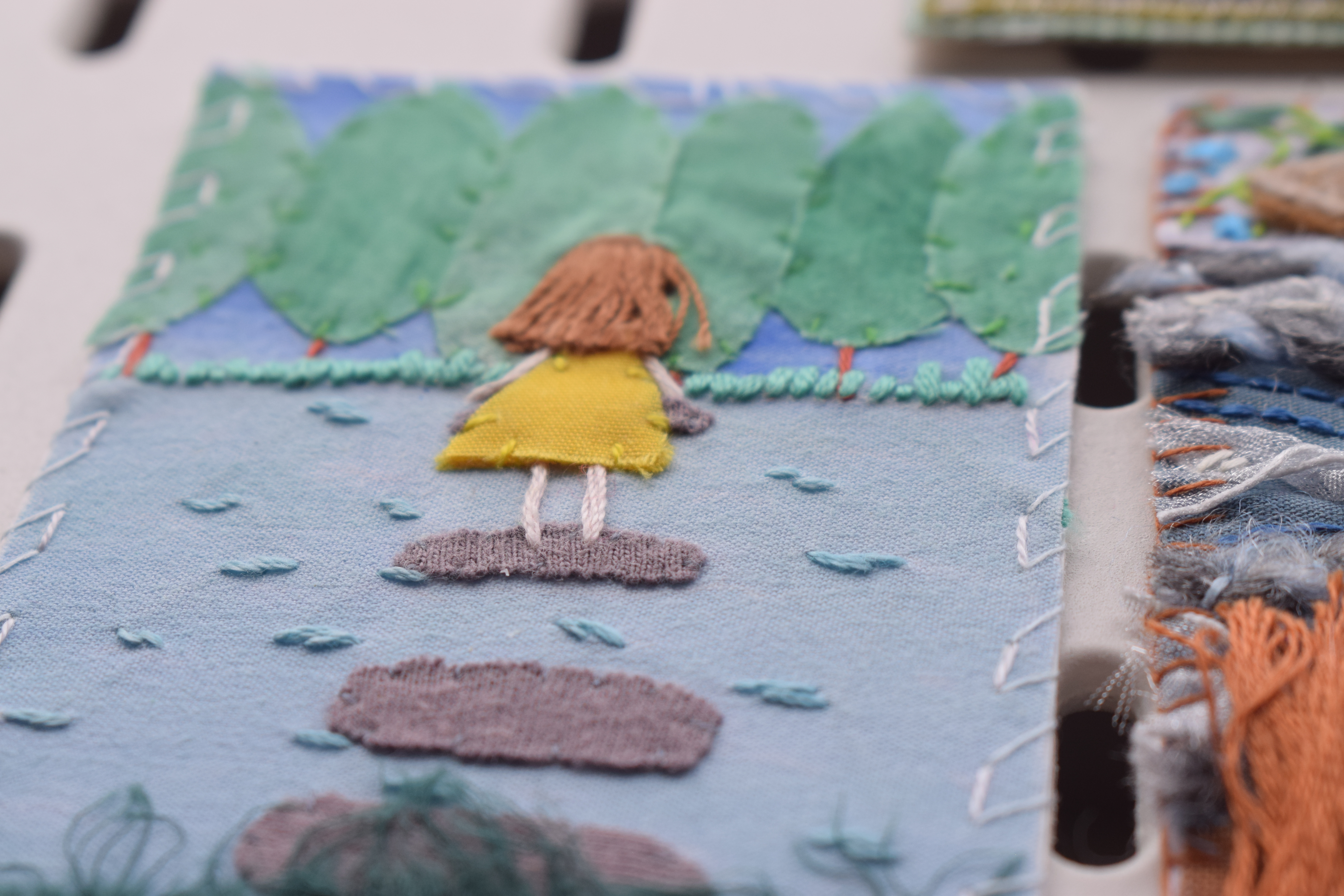
This piece started as a workshop demonstration piece, the initial story of which you can read here, before being used as a bus project. It has been made using fabrics that are all available in my web shop (small plug there! And bigger link here!) and I've also utilised the fluffy selvedge edges from the batik fabrics as a textured fabric edging on the water. 


It's quite a quick and simple little piece, nothing particularly complicated about it and more embroidered as a way of keeping my hands busy whilst out and about on the commute. Embroidery is so mindful and relaxing, you can just be in the moment and not really have to think about anything other than what pops into your head. I do also use it to help me work through thoughts too if I've got a complicated problem, because you aren't stressing about whatever it is and usually a solution pings in after a while. 

The lovely yellow linear fabric has a beautiful horizontal striping to it and I've just followed this with a single strand of back stitch worked in two different colours to emulate a setting sky with its washy streaks. The same two colours have been used in the needle at the same time to create two strand bullion knots on the fabric edge. 


There's a lot of difference in the colours here from when it's sunny or not - either that or there's a bigger change between a phone camera and a proper camera but the next few photos were taken on an overcast, drizzly day but with a better camera and the colours look much cooler.


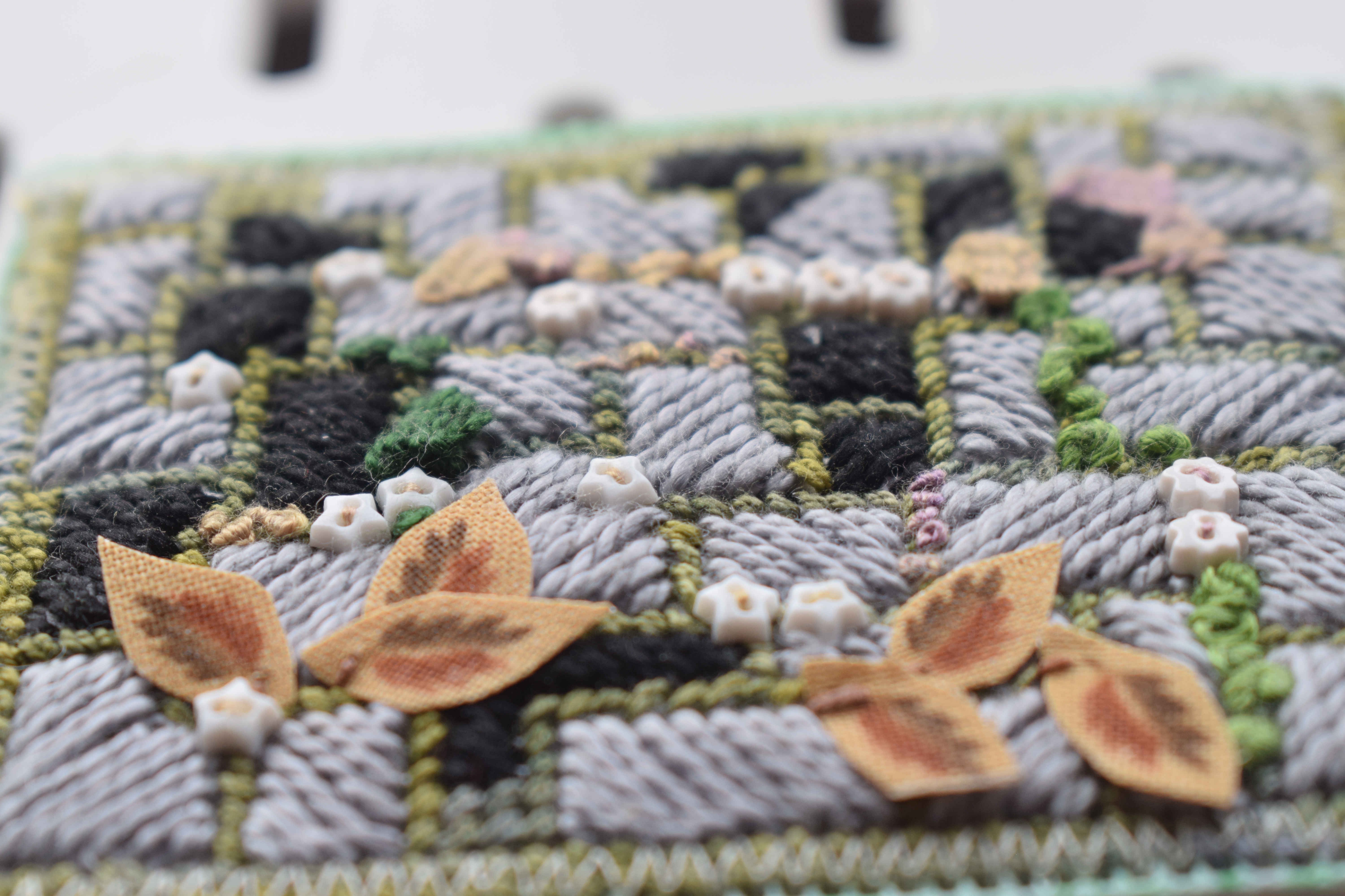
My top green mountain layer has been textured by padding out all of the blobby shapes in the batik print with satin stitch, and I've used three different colours of green for the blobs - partly to use up odds and ends of threads, and partly because I didn't have quite the right green in my travel pack at the time. It is more exciting though than just having the whole layer the same colour so in a way I'm glad that some boundaries were pushed by just having a go and seeing if the colours worked or not. If they don't there's no harm in just unpicking! 
The layer has been edged by couching two colours of embroidery thread together and trying to keep the edging quite puffy, so I wasn't pulling on the threads as they were couched. Each individual thread was also separated before being loosely put back together so that any twists were removed and they would lie next to each other. 


I've done quite a bit of couching in this piece as the next layer down as also been edged with couched embroidery threads. This time all the same colour and with slightly less thread. The batik print on this layer is really busy and I toyed with the idea of filling in every single dot but I think ultimately it would have been way too much! Instead I have gone around the larger spots with a single strand of back stitch, then chosen a few lines of the printed spotted lines to fill with french knots. I think it looks quite cool actually, and the lighter green colour stands out but doesn't look completely odd as it matches the pale, washed background on the batik in the centre. To me it's like an overgrown vineyard with some of the rows of vines still intact. 


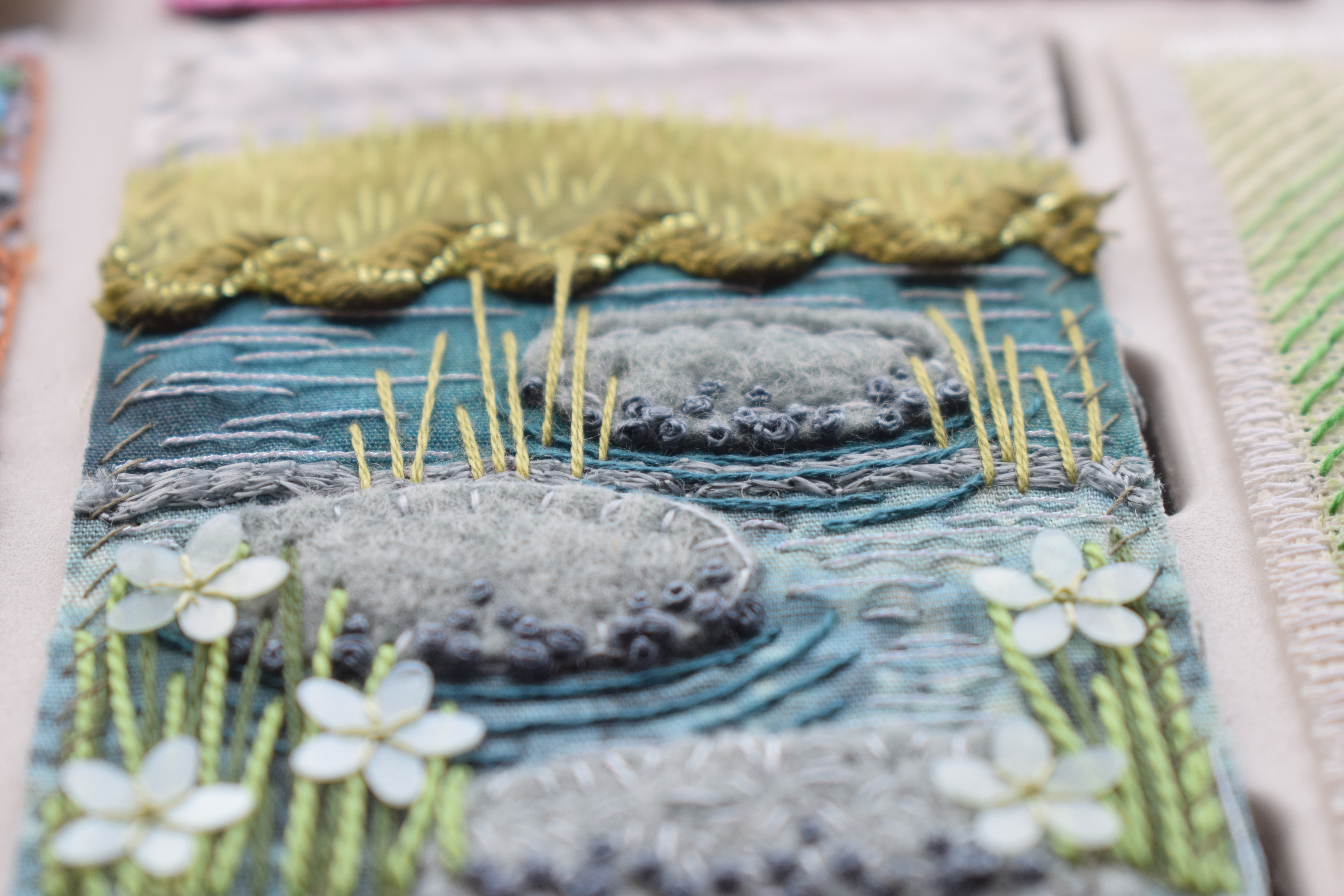
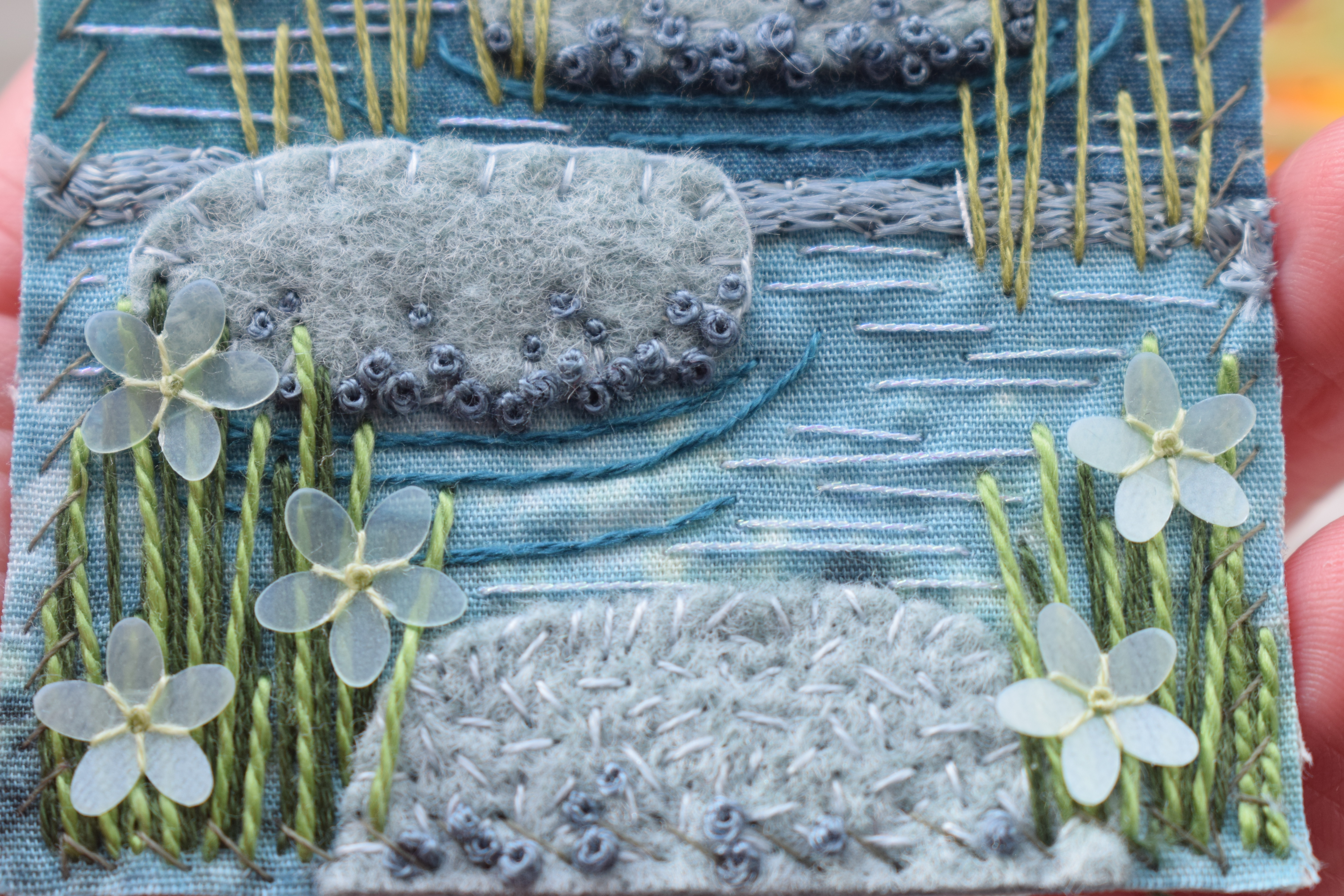
If you read my previous post about starting this piece, you'll know that when I cut the fabric layers up and tidied the edges, I saved the selvedge edges because they were just so beautifully fluffy! Everything about proper batik fabrics is lovely, the weight of it, the tightness of the weave (meaning less fraying, although slightly more difficult to stitch through), the patterns and colours, and the edges!
I combined the three batik selvedges together, layering them up and stitching them down one at a time. The blue went down first as I didn't want it to sit on the water's edge, more like a reflection further away, then the two greens. They've been stitched slightly lower down the hoop edge time so there is a staggered effect, and I've added yet more couched embroidery threads - using three colours this time-to the very edge of the fabric of the selvedge to hide the straight cut. These couched threads have been stitched down in exaggerated waves which sit up from the surface of the hoop and move around, much like plants on the bank of a river really would. 


Over the top of this I have made straight stitch stems in two colours, adding pops of yellow, to balance with the yellow sky, as sets of three french knots to be a sort of reedy flower. Adding some glitz to the stems are these lovely little glass seed beads in an oily green that just catch the light and could be bubbles on the surface. Adding a small amount of sparkle somewhere really lifts an otherwise very matte piece. 


The water has been almost crudely stitched, with single strand whipped running stitch (the running stitches and the whip stitches are two different colours), following the two lines of the edges. Between these lines I've made big running stitches in a single strand of metallic embroidery thread in pale blue for a little extra sparkle - although these possibly stand out more than I would like. I don't dislike it enough to pull them out though as again the paleness of them matches the paleness of the french knots in the layer above. I've also just noticed that I've missed some tacking stitches in the water so after finishing this post I'm just going to go and quickly pull those out!


The final stitch run down for this piece is; bullion knots, back stitch, couching, satin stitch, french knots, straight stitch, running stitch, whip stitch and beading. 

Wednesday 27 March 2024

February Stepping Stones Swap

Oh golly gosh, I really like these cards! There's so much wonderful variety and texture, and perspective, in them. It's interesting to me at the moment to look through them and try and see it from a design and composition point of view - in a few weeks I'm giving a talk on Colour and Design, two incredibly broad subjects to be crammed into a short session, and quite a lot of the design element involves composition, perspective, the vanishing point, the rule of three etc, and you can clearly see these principals reflected in these cards. 

The two cards on the right hand side really emphasis the vanishing point, as the lines recede into the distance in a clear triangular shape, as if they are disappearing to an imagined end point on the horizon. I've sort of done the same thing but in a more wiggly way, as has the card in the centre. The perspective here is created by making the shapes smaller and therefore appearing further away in the landscape. The horizon lines are still there but being meandered to rather than walking a direct route.


A few of these cards are appearing to be viewed more from a birds-eye-view, so they don't have a horizon for anything to vanish off into. They are more textural and use other compositional tricks (most of which are usually completely subconscious, I doubt everyone would have been reading into why they have placed certain elements in certain places). The rule of three, or odds, appears several times. Things in threes look more harmonious, natural and visually appealing whilst bigger odd numbers challenge the brain slightly but can create a balance with the central point and even numbers either side of it. 


I love these little teeny weeny buttons on this paving piece. the colours here are lovely with the little knots and picot stitches embroidered into the gaps between the slabs, and the cut out fallen leaves just lightly stitched on top! It's really clever. 


The little lady in this piece is really evocative too, especially with her yellow dress contrasting beautifully with the blues!! (I've been thinking a lot about this talk, can you tell?)


The stitching on this one is really nice too, lots of little french knots and detached chain stitches to build up texture with the moss or flowers - different sizes of french knot too to create subtle changes in height. I like how the buttons have been stitched down!


The vanishing point perspective is strong with this piece - it's very visually striking, all lines point to the flowers in the centre so your eye can't help but be drawn to it, and then with the pop of the red against green and white it's almost like you are being zoomed into it for a closer look. 


At the end of the day though, once you've analysed all sorts of reasons as to why a piece works, all that really matters is that the ladies had fun making and stitching and thinking about their pieces, rummaging through their stashes for that perfect fabric, or searching for inspiration around them. The more you practice and make and do, the more easily you can understand or bend and break the rules and enjoy what you're doing with confidence. There is no right and wrong, and these beautiful cards clearly show that by being themselves.


Sunday 24 March 2024

Stepping Stones ATCs


I loved making these ATCs. I wasn't sure it would pan out with the felt stones but actually I really love them and the way the different textures cast shadows and give it an overall three-dimensional effect. 
The colours really appeal to me as well. I have a little stash of small offcuts of felt which I purchased as a bundle and included a whole rainbow of colours so there's always one that fits my needs and for this one I had a few options to consider - sandy beige or a dark brown or a moss covered green. Strangely it was this bluey/grey that spoke most to me and I love how it seems to reflect the blues of the water. 


Each of the three stepping stones have been stitched with a different stitch to make them look slightly different. The bottom one is textured all over with seed stitch, the middle one edged with blanket stitch and the top, smallest one, outlined with back stitch. I think if they had all been done the same it would have looked a bit odd so I'm glad I took the risk of making them different. To help with the perspective and give distance, they also get slightly smaller the further away they go (or the higher up the card they sit).
They have all been given the same french knots at the bottom though to bring them together. I'm not sure what the knots are representing really - bubbles or lichen or just knobbly bits on the rocks, but they look cool so that's ok. 


There is fairly simple stitching on the rest of the card. The top fabric has no real stitching on, the green grassy fabric already has a grass texture print on it so all I've done is add some single strand straight stitches just to emphasise the grassy-ness of it, and there's a wonderful shiny textured ric-rac at the bottom to mark the edge of the bank. It's probably a bit chunky for the piece really but I loved the metallic strip going through it that I thought could reflect the water below, and the colours went so beautifully with the greens above. 


The two blue fabrics have been divided by a strand of Stylecraft Moonbeam yarn which I couched down before stitching the central stepping stone on so that it was pushed into the background. Stem stitch in a darker blue thread has been stitched to make ripples curving around the stones, and then a single strand of metallic thread has been stitched in random horizontal straight stitches to act as the water running through. I did actually add these in after my green stems so I had to slide my needle underneath the green reeds to make some of them, rather than leaving lots of gaps behind - it makes it look a little bit more natural as the slight metallic sheen peeps through.


Whilst the stems further away have been made with two strands of stranded cotton, I've used stranded cotton and cotton perle threads at the front to make the reeds chunkier and seem closer to the viewer. Glorious flower sequins have then been stitched over the top. I think these are super sequins, they have a slight cone shape to them so they aren't flat, and the petals are translucent and slightly pearly so they catch the light in a really delicate way. I would love to find out a big supplier of these to be able to offer them in my shop but I've only come across them in small packets at stitching shows, they don't even have a supplier name on to help me track them down. If anyone knows - clue me in!
To stitch them I have used a single strand and stitched between the petals into the central hole, then made a tiny french knot (one strand, two twist) in the centre to finish them off. 


I love the movement in these, and the fact that there are shadows cast which helps to give it life. You can almost hear the water trickling through the stream as you hop over the stones. 
To finish, the final stitch run down is; seed stitch, straight stitch, french knots, stem stitch, couching, blanket stitch and back stitch.